Step into streets where palettes breathe, pavements glow, and hidden pigments tell stories. Today’s theme is “Walking the City: A Color Harmony Experience”—a gentle invitation to explore urban rhythms through hue, contrast, and mood. Subscribe, comment, and share your palettes as we stroll.
Color Theory on the Crosswalk
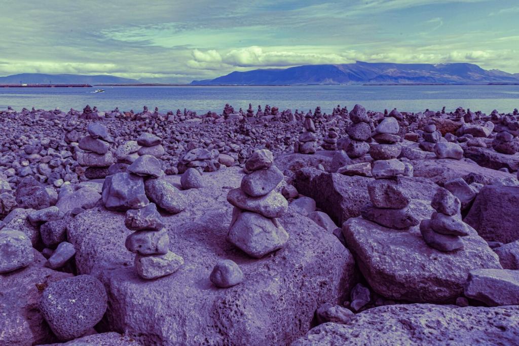
Walk a stretch where facades drift from olive to moss to pine. Analogous schemes soothe attention, letting you notice texture, typography, and pace. They’re perfect for reflective walks that loosen the day without draining energy.
Color Theory on the Crosswalk
At busy corners, search for triads—perhaps a cobalt bike, a saffron tote, and a magenta poster. Balanced triads feel playful, not chaotic, when one hue leads and the others whisper support through small, repeated accents.
Expose for Color, Not Brightness
Dial exposure until saturated details hold their integrity—no clipped reds or artificial blues. Slight underexposure often protects nuance, allowing textures and midtones to carry harmony instead of being flattened by glare.
Composing with a Dominant Hue and a Whisper
Choose one dominant color in frame, then find a small counterpoint—perhaps a single scarf or sticker. This guiding duet simplifies scenes and teaches your eye how minimal accents can steady a bustling backdrop.
Weekly Challenge: The Two-Hue Walk
Pick two colors before you head out. Capture five images where they converse naturally—no staging. Post your favorite pair with a line about mood, and subscribe to receive next week’s prompt in your inbox.
Textures That Tint the City
01
On old stairwells, greens lean into earth tones, softened by moss and moisture. Paired with rust, they form a grounded duet that lends patience to narrow alleys, inviting slower steps and deeper breaths.
02
Fresh concrete cools warm signage, while weathered slabs warm bluish metals. This neutral stage shapes balance like a good host—present but humble—letting small accents perform clearly without overwhelming the scene.
03
Share a photo or description where texture altered your perception of a color—glossy paint turned bold, chalky brick turned soft. Tell us what changed in your mood, and subscribe for texture-focused field notes.
Designing a Route with Color Anchors
Select three anchors—a canary mural, a bottle-green square, a terracotta arch. Walk them in an order that builds a gentle gradient, noticing how your energy changes as the city’s palette gradually shifts.
Mist desaturates and unifies; hard sunlight heightens edges; drizzle deepens pavement into dramatic charcoal. Check the forecast, then pick a palette that will thrive under those conditions rather than fighting the sky.
Choose one color to inhale with and another to exhale with as you walk—perhaps inhale with soft green, exhale with warm gray. This pairing grounds attention and makes the street feel kinder and more legible.
Mindful Walking: Emotional Harmony in Hues
After your walk, write five lines—one per hue—that capture feelings, sounds, and textures. Keep the language simple. Over weeks, patterns emerge, revealing which palettes brighten, steady, or gently slow your mind.